If you've used Ana for in-conversation analytics, you've seen Ana drop charts directly into the thread — fast visuals for quick questions that don't need a full dashboard. Until now, those charts were static images: a snapshot of the answer, but not the answer itself. If you wanted to go deeper, zoom in on a segment, or inspect a number behind a bar, you had to ask again.
That changes today.
Introducing Dynamic Visualizations
Dynamic visualizations sit between a one-off chart and a full Dashboard. While Dashboards are persistent applications, saved, scheduled to refresh, and shared across your team, dynamic visualizations are something different: a higher-touch way to explore data in the moment. Instead of a static image, you get a live chart you can zoom into, filter by segment, and drill through, all without looping Ana back in.
Expanding What Ana Can Visualize
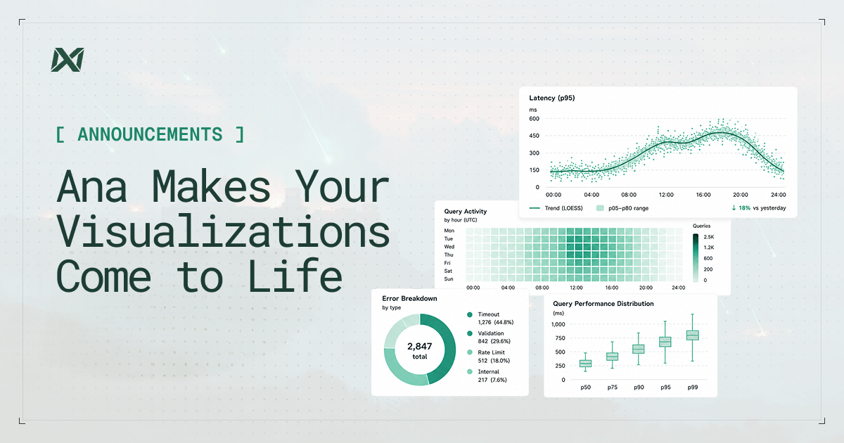
Ana's visualizations are now generated using ECharts: the same JavaScript library that powers interactive graphics at the New York Times and across the best data journalism on the web. The output is no longer a screenshot of your data. It is a self-contained program that runs directly in your browser, with your data already embedded inside it. Hover tooltips, zoom controls, legend toggling, range selection: all of it is instant. Nothing goes back to the server.
ECharts produces polished, enterprise-grade charts with interactivity built in by default, and it spans the full range of what a question might need: time series, scatter plots, heatmaps, and statistical distributions.
The Right Chart for the Question
Ana picks the chart type that fits the question. A time series gets a line chart with zoom and pan (try scrolling to zoom on the chart below). A distribution or correlation gets a scatter plot. The chart fits the data, not the other way around.
Hover, zoom, and toggle series — all running natively in your browser.
Exploring your data should feel good. Zooming into an anomaly, toggling a segment off, hovering over an outlier to confirm what you suspected: these are small moments, but they add up. Interactive charts make that kind of hands-on exploration part of the conversation with Ana rather than a separate exercise.
Available Now
Dynamic visualizations are now available in beta for all TextQL customers. Open any conversation with Ana and ask for a chart. For questions or feedback, reach out at support@textql.com.